
Callisto
Sleep Wellness App
Callisto is a conceptual sleep wellness app designed to address the rising challenge of inconsistent and poor-quality sleep. I designed Callisto for four primary personas:
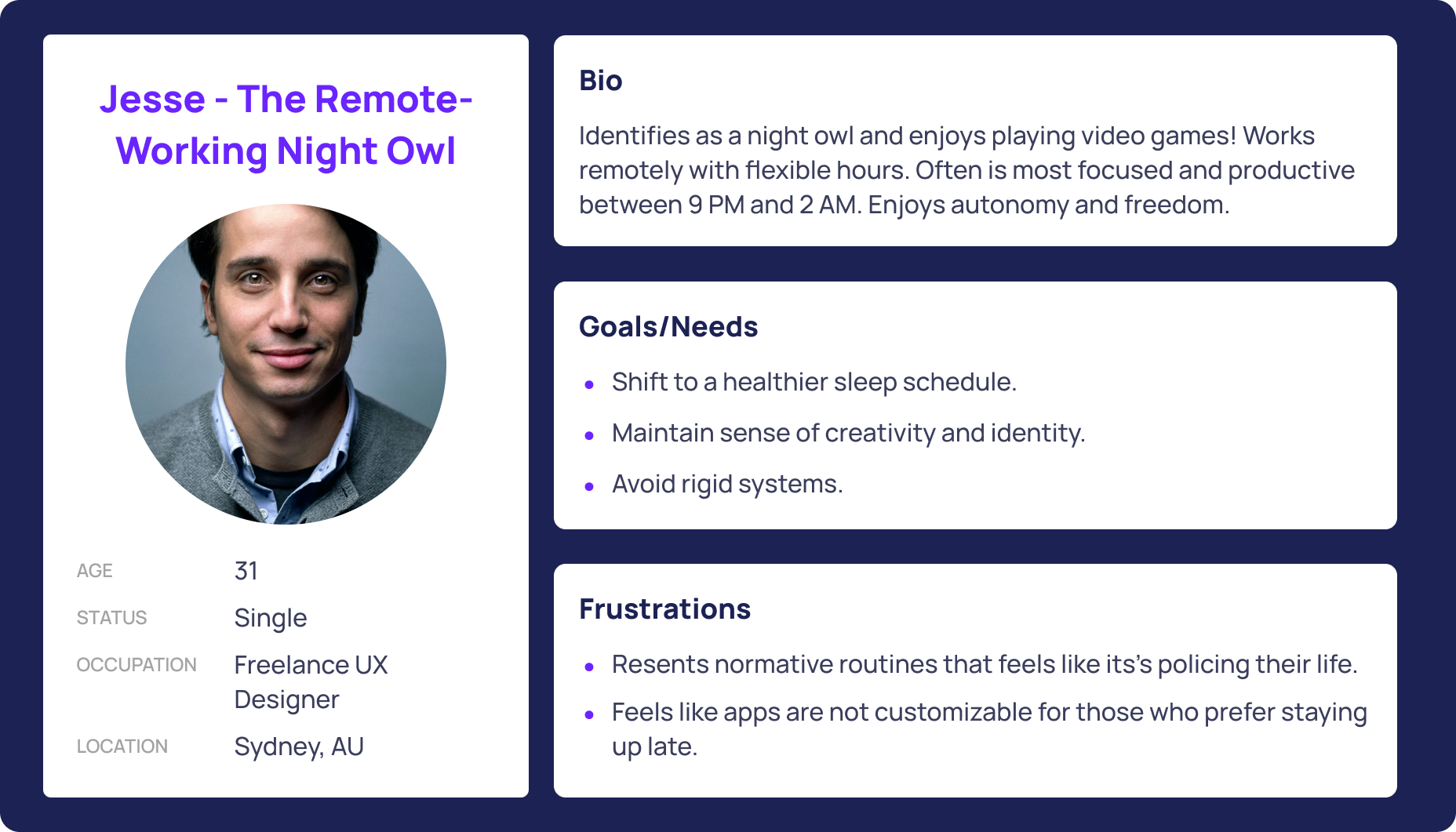
a remote-working night owl
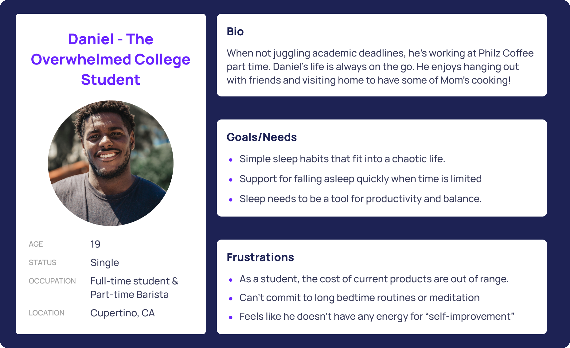
an overworked college student
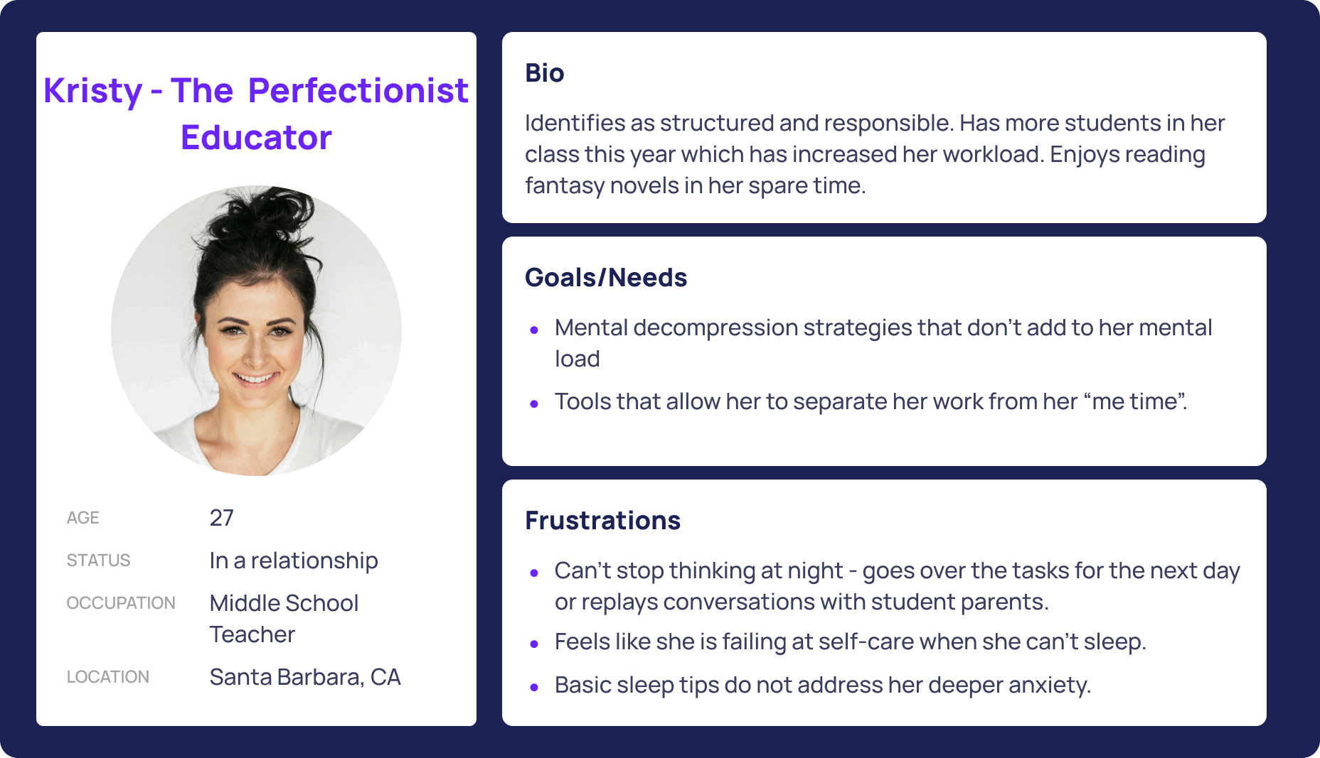
a perfectionist educator
stay-at-home parent
This diverse range reflected common barriers such as stress, guilt, schedule chaos, and overstimulation.
The goal was to design more emotionally attuned and thoughtfully designed sleep tool could help these users develop small sustainable rituals which in return would help them rest better and feel in control again.
Overview
Role
Product Designer (UX/UI)
User research · Behavioral design · Information architecture · Wireframing · Prototyping · Brand identity · Design systems
Timeline: 6 weeks
Sleep apps tend to fall into one of two traps: they're either clinical and data-heavy, treating rest like a performance metric, or they're so feature-rich that just opening them feels like work. Neither approach serves a user who is already exhausted and overwhelmed.
The core challenge wasn't just designing a sleep tool. It was designing one that felt like relief.
Problem
Research
To understand the problem deeply, I conducted a mix of qualitative and quantitative research. I began with a user survey that received 47 responses, gathering data on sleep habits, tool usage, and emotional pain points. I followed this with 6 remote and in person interviews to dive into personal stories, daily obstacles, and emotional triggers.
Some interview questions included:
Can you describe your sleep environment?
How often do you experience sleep-related issues like trouble falling asleep or staying asleep?
Do these issues happen daily, weekly, or only occasionally?
How do these issues impact your overall well-being during the day (e.g., mood, energy levels, work productivity)?
Have you ever used an app or product to help with sleep? Why did you stop or stick with it?
Do you practice any sleep hygiene habits (e.g., avoiding caffeine before bed, winding down, limiting screen time)?
Key insights:
50% reported that they had never used a sleep tool: Participants reported poor sleep quality which helped identify that awareness wasn’t the barrier. It was skepticism and not knowing where to start.
Stress, anxiety, work schedules, and caffeine were the most cited culprits for poor sleep beyond bedtime habits. This meant that sleep cannot be isolated from emotional and lifestyle factors. A routine-focused solution will only go so far without supporting the bigger picture.
There’s a motivation–action gap. Users recognize the problem but doubted that any solution would work for them and their needs
Feature overload and performance tracking mentalities were consistent reasons users had quit or avoided sleep apps entirely. Participants didn’t want another dashboard to manage.
These insights showed that the design problem wasn’t “how do we track sleep better.” It was “how do we lower the mental load while supporting better sleep.”
Definition & Strategy
Problem Statement
Users struggling with poor sleep do not need more data or complicated tracking features. They need a tool that acknowledges the lifestyle weight they are already carrying and makes the first step feel easy to take.
User Personas
Research surfaced 3 user archetypes, each with their own version of the same problem.
The Remote-Working Night Owl: wants to shift their sleep schedule but is worried that it will cost them their independence and creativity.
How might we help users shift their schedule without feeling like they're giving up their freedom?
How might we reframe earlier sleep as something that supports, rather than stifles, creativity?
How might we let users experiment with change in a way that feels flexible and self-directed?
The Perfectionist Educator: lies awake replaying work conversations and to do lists, feeling like anxiety is stronger than any bedtime habit she tries.
How might we help users release mental loops and calm their minds before bed?
How might we integrate emotional decompression into a bedtime routine that feels productive rather than indulgent?
The Overworked College Student: perpetually deprioritizes sleep because there is not enough time and genuinely does not believe better sleep can fit into his life.
How might we help users see sleep as a tool that supports everything else they care about, not a burden on top of it?
How might we make small improvements feel achievable within an overloaded schedule?
How might we integrate small habits that require minimal effort?
These HMW questions guided me throughout the design process.
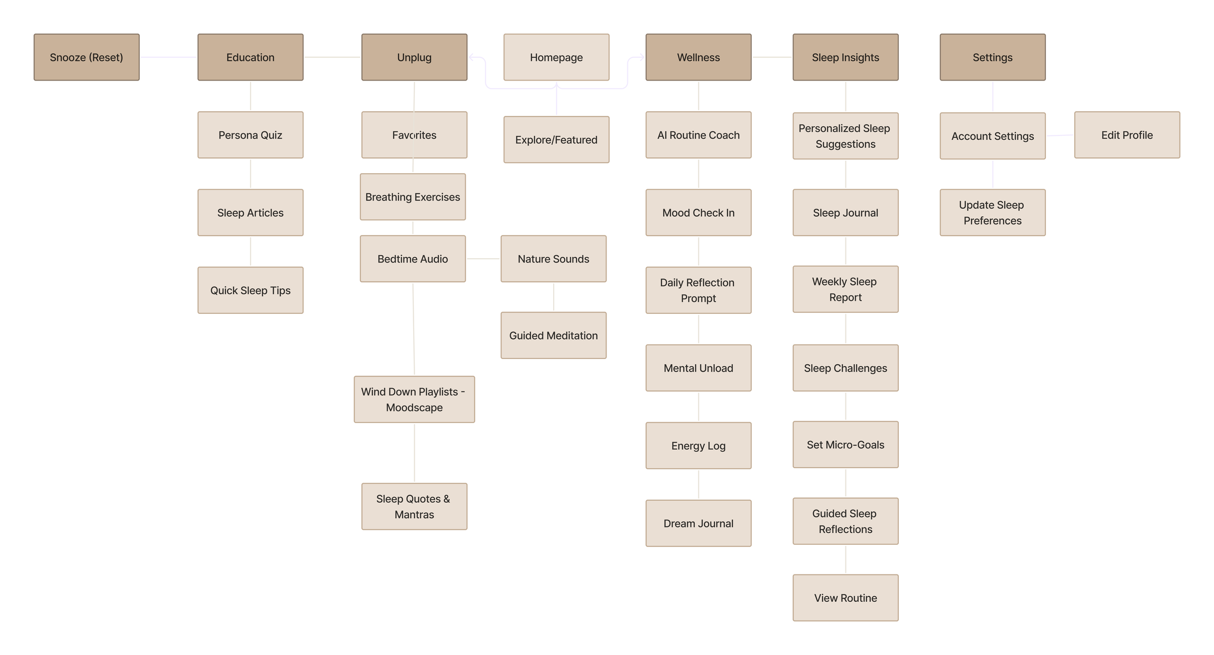
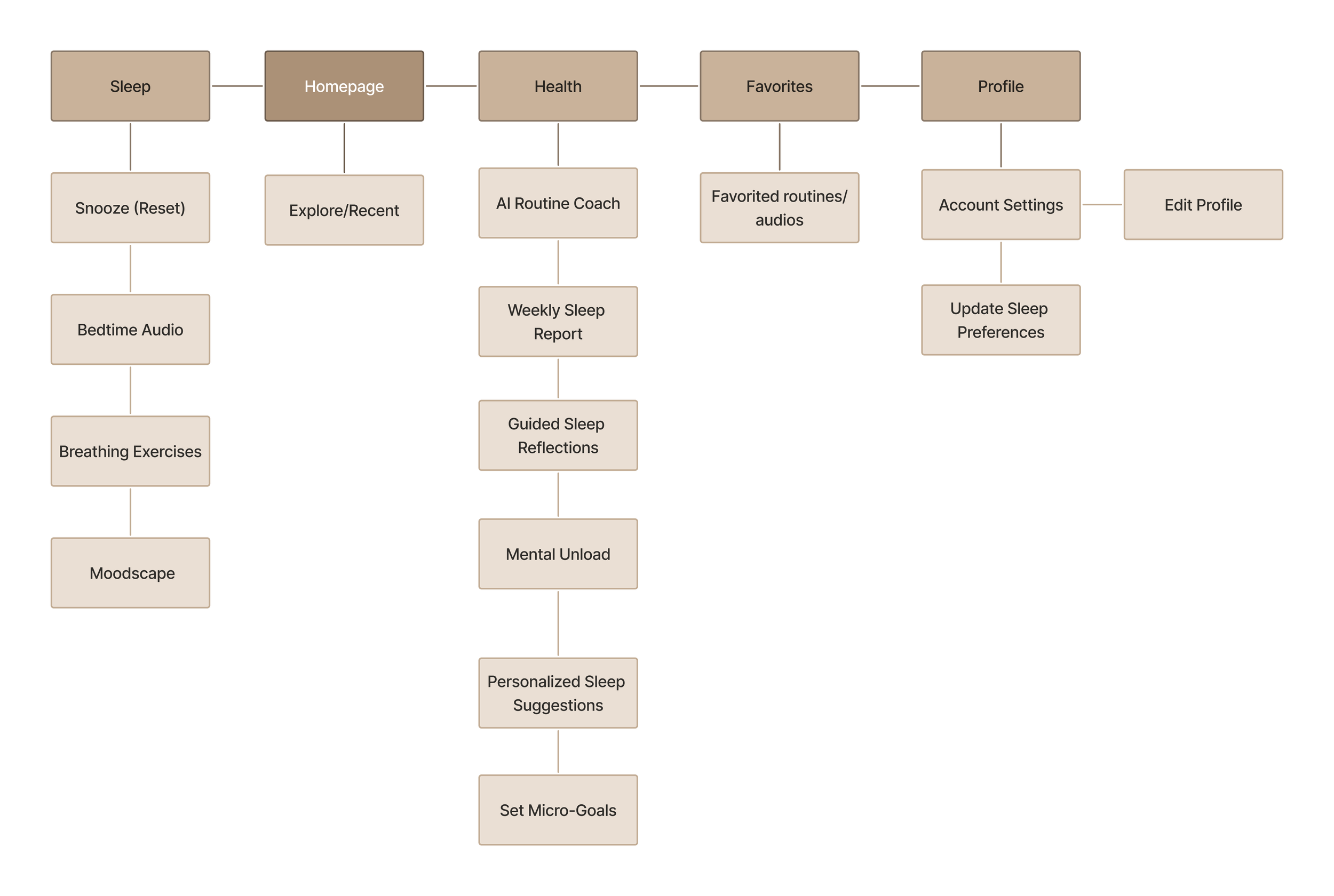
Prioritization & Roadmapping
Sitemap
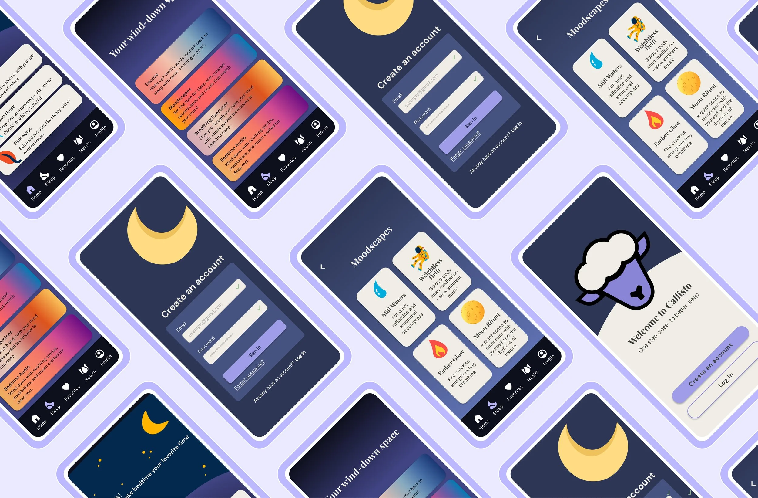
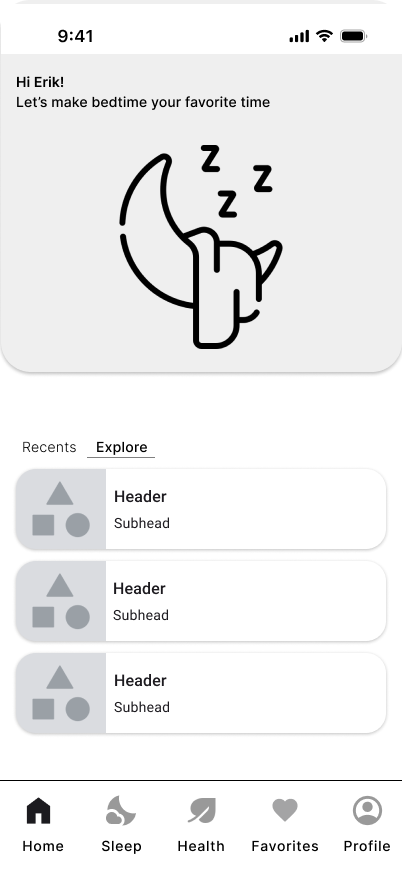
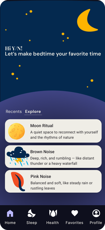
Callisto was initially structured around a plethora of features created based on HMW questions. After reassessment, the app was condensed to five core pages:
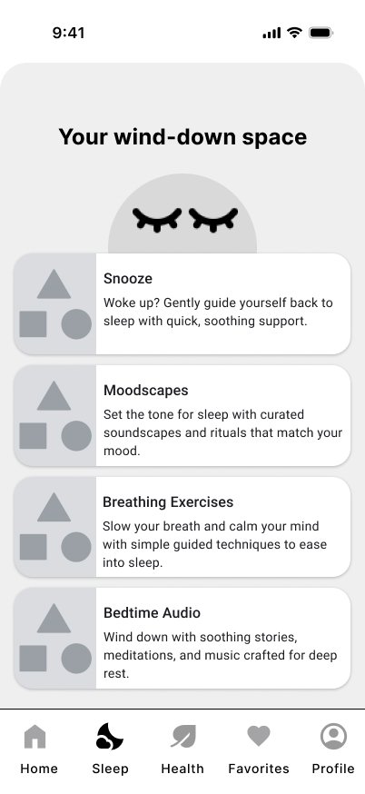
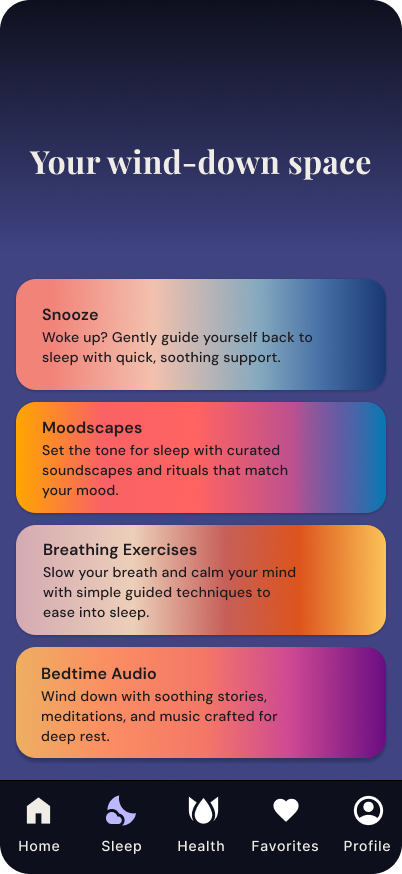
Sleep — the primary hub, containing four features: Snooze, Moodscapes, Breathing Exercises, and Bedtime Audio
Health — a sleep tracking page that connects to wearable data or offers a short self-reported survey
Favorites — quick access to saved content and routines
Profile — personal settings and preferences
MVP Focus
The MVP was scoped around Moodscapes, the feature that most directly addressed the motivation-action gap surfaced in research. It was designed to remove as much friction as possible from the act of starting a wind-down routine, and it became the centerpiece of the prototype.
The Sleep page's other features were mapped in the sitemap but not fully wireframed, creating a clear roadmap for future development without overextending the MVP scope.
MVP Concept & Ideation
Wireframing
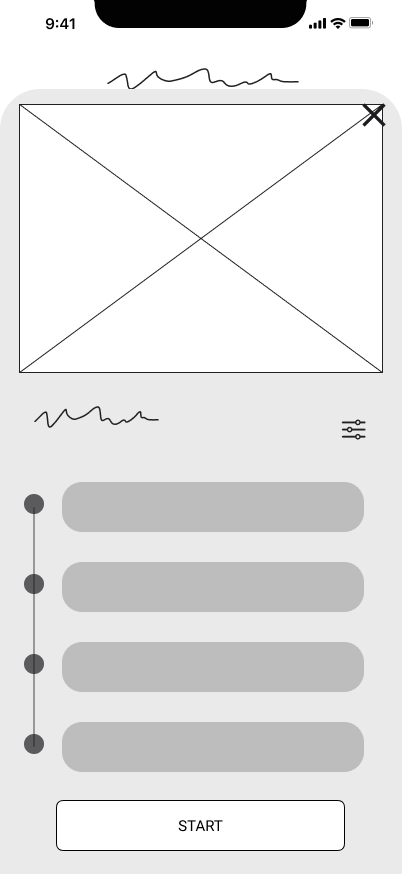
Low/Mid-Fidelity Wireframes
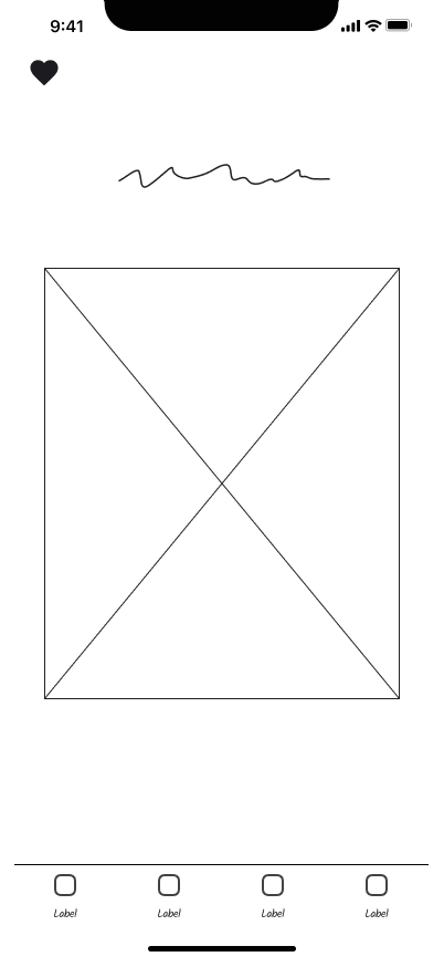
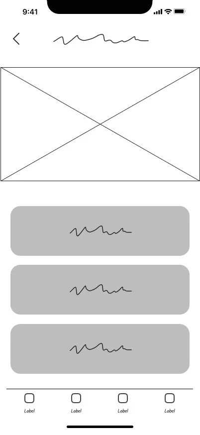
I began in Figma with low-fidelity wireframes focused on structure and flow rather than visual polish. The goal at this stage was to map out the Moodscapes user journey ent-to-end and test the logic before committing to any visual decisions. From there I made mid-fidelity wireframes with small changes.
Flow: Homepage → Sleep Page → Moodscapes → Preview → Audio Player
Moodscapes Feature
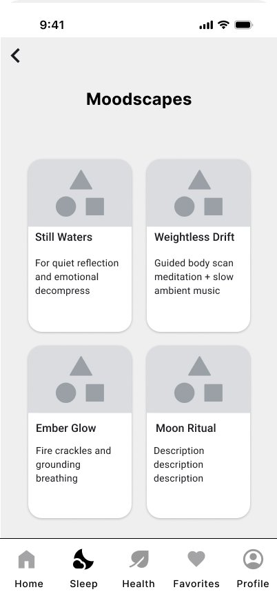
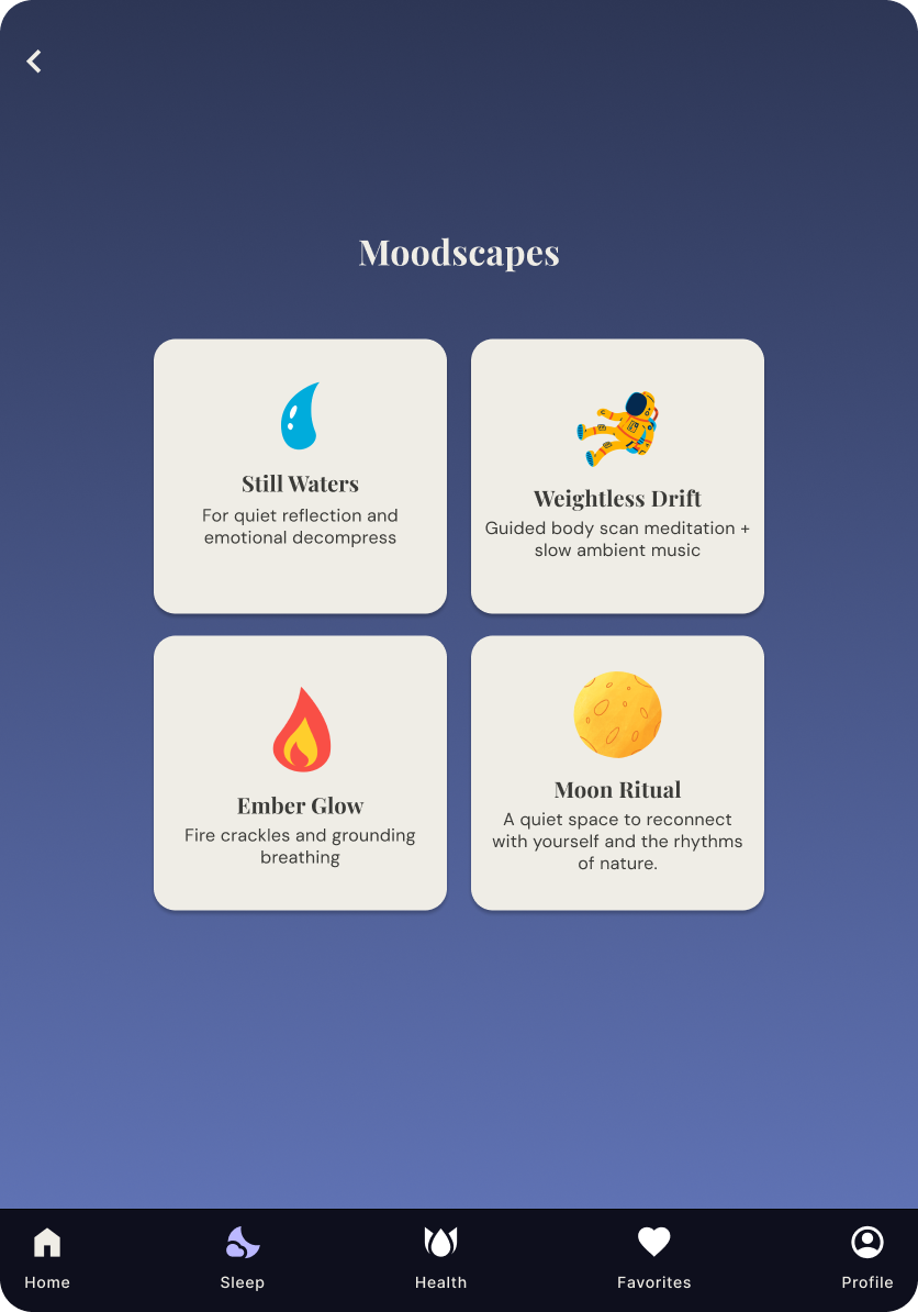
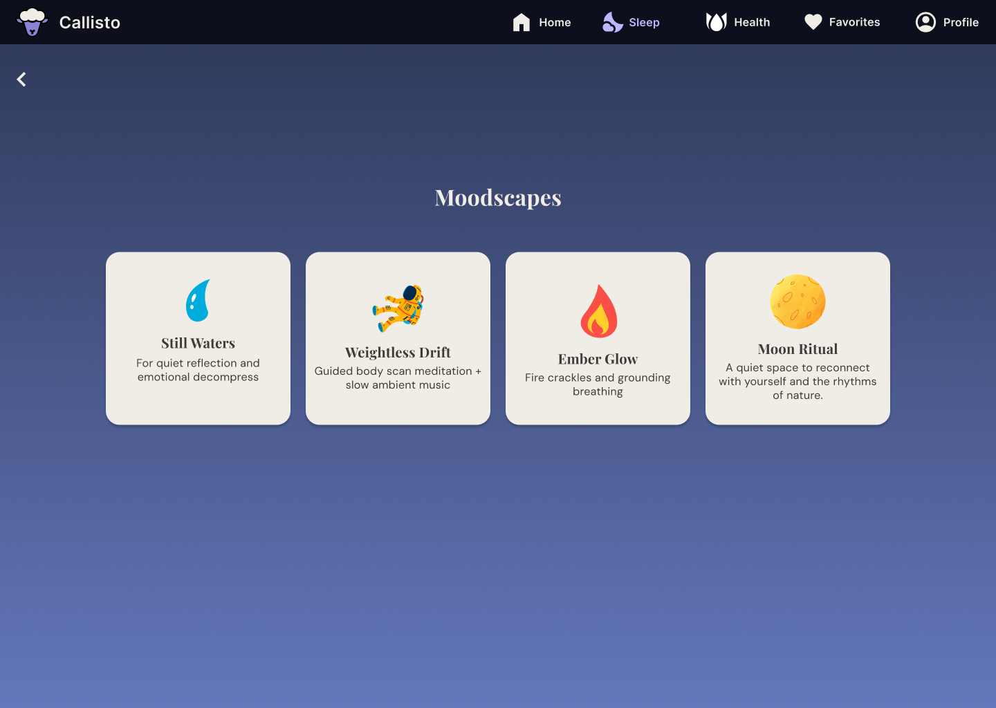
Moodscapes is an emotionally-driven entry point into Callisto’s content. Instead of asking a user to browse a library or make decisions when their brain is already tired, Moodscapes asks one simple question: how are you feeling right now?
The user selects from four mood-based cards, each mapped to a specific emotional state and a curated wind-down experience:
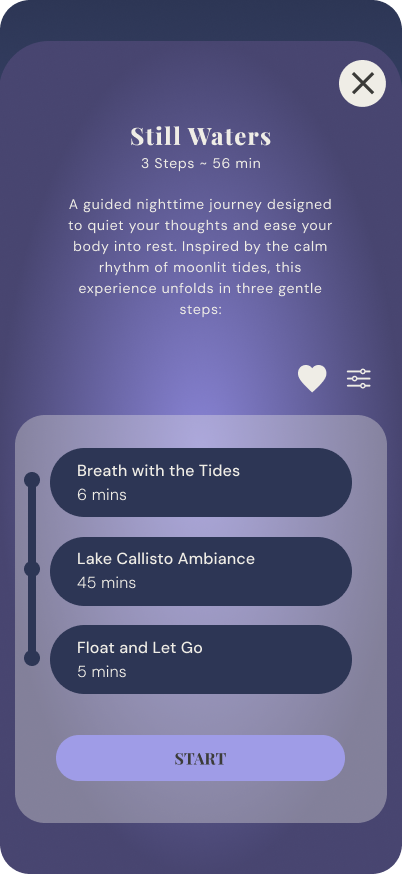
Still Waters: for quiet reflection and emotional decompression. A gentle space for users who need to process before they can rest.
Weightless Drift: a guided body meditation paired with slow, ambient music for users who feel physically tense or mentally scattered.
Ember Glow: fire crackle soundscapes combined with grounding breathing exercises, for users who feel restless or anxious.
Moon Ritual: a quiet, nature-inspired space for users who want to reconnect with themselves and slow down intentionally.
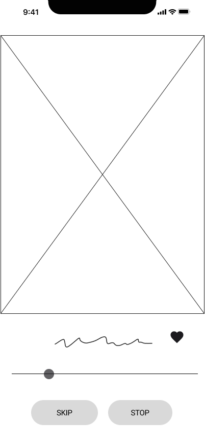
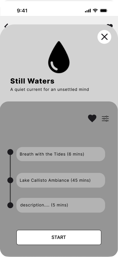
After selecting a mood, the user lands on a preview screen that shows the session name, a short description, the duration of each section, and a play button. This removed the pressure of committing to something unknown. Users could see exactly what they were stepping into before they started.
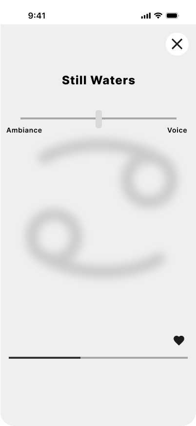
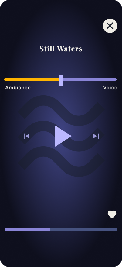
From there, the audio player gave users control over their experience without requiring active attention. A dual-color slider allowed them to adjust the balance between ambient sound and guided voice, making it immediately clear that increasing one would decrease the other. Users could also skip between sections if something wasn't working for them.

Branding & High-Fidelity Wireframes
Visual Identity
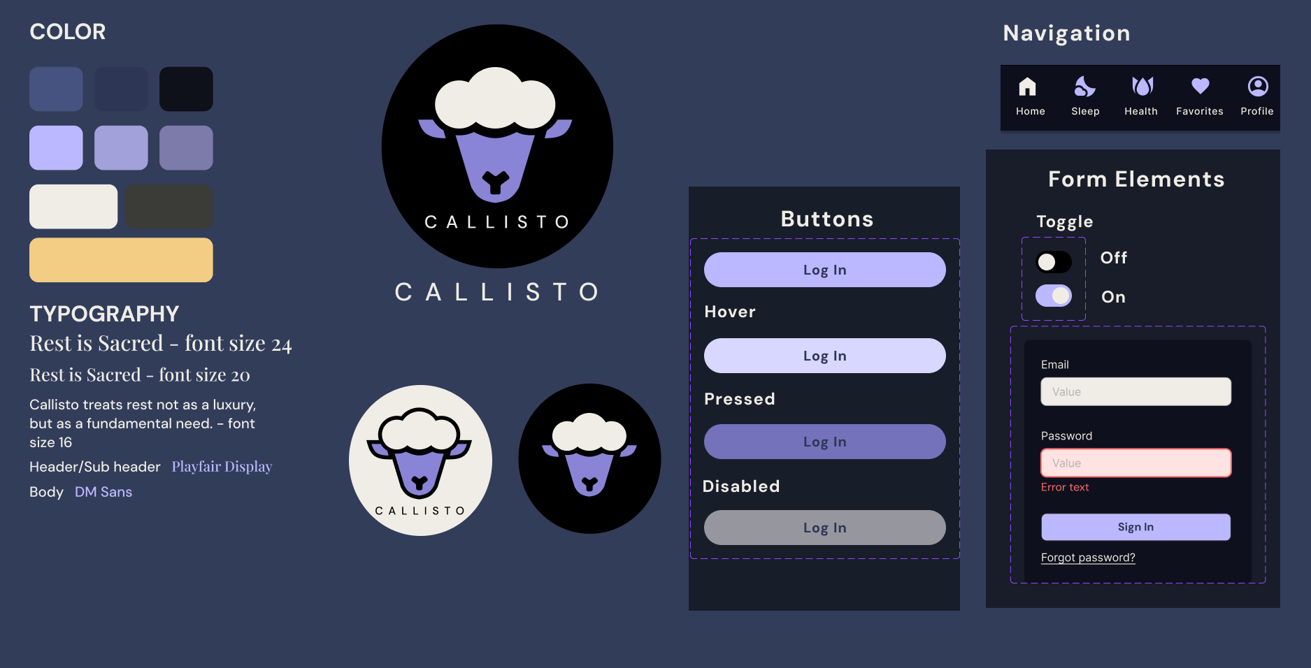
The visual identity of Callisto emerged from three anchoring ideas: lunar symbolism, softness, and the kind of quiet that feels intentional rather than empty.
Logo: A wordmark paired with a hand-drawn open spiral and a sheep icon — a nod to the universally familiar act of counting sheep, reinterpreted as something warm and slightly whimsical rather than childish.
Color Palette:
Navy: grounds the experience in nighttime. Creates contrast and a sense of depth without being harsh.
Lilac: softens the palette and signals calm. Warm enough to feel inviting at night.
Cream: the primary surface color. Easier on the eyes than stark white in low-light conditions.
Typography: A combination of a display typeface for headers and emotional moments, and a clean sans-serif for body copy and navigation — balancing warmth with clarity.
UI Kit: Night-friendly tones throughout, with components designed to minimize cognitive load. No jarring transitions, no aggressive calls to action, no progress metrics that could trigger performance anxiety.
High-Fidelity UI
The hi-fi designs gave Callisto its identity. Every visual decision was made in service of the same emotional goal: make the user feel like they are beginning their nighttime ritual.

Methodology
I conducted prototype testing with 5 participants, a mix of remote sessions over Zoom and in-person observations. Participants were given specific tasks to complete within the Callisto prototype while I observed for hesitation, confusion, and moments of delight. I collected both behavioral observations and self-reported feedback.
Results
Overall, users navigated the core Moodscapes flow with ease. The mood selection screen landed well as users understood it immediately and appreciated that the decision was already framed for them rather than leaving them to browse.
The most significant UX-driven change came from testing: the dual-color slider on the audio player. Users consistently struggled to understand intuitively that adjusting the slider would increase one element (ambient sound or guided voice) while decreasing the other. The original single-color slider looked like a standard volume control. Adding a second color to represent each side of the balance resolved the confusion immediately and users could now read the slider's meaning at a glance, without instructions.
This was a small change with a meaningful UX impact as it turned an interaction that required explanation into one that was self-evident.
What I Would Test Next
If I had more time, I would bring in more non-tech-savvy testers earlier in the process. Most of my participants were comfortable with mobile apps, which may have masked points of friction that would surface for a less digitally-fluent user.
Testing & Iteration
Mobile-First
Callisto was designed mobile-first, which shaped every layout and interaction decision from the ground up. The bottom navigation bar kept all five primary destinations reachable with one thumb. Tap targets were sized for comfortable use in a dark room, and content was prioritized vertically so users could read and act without unnecessary scrolling.
Tablet Adaptation
On tablet, the structure stays intentionally close to mobile. Because tablets are still touch-first devices, the bottom navigation bar persists. The Moodscapes cards remain in a 2x2 grid but gain more horizontal breathing room, giving each card's title and description space to sit comfortably. The overall layout feels familiar to a mobile user, just more spacious.
Desktop Adaptation
The most significant change at desktop was navigation. The bottom bar was replaced with a persistent top navigation bar which is a pattern consistent with consumer wellness apps and familiar to desktop users. The wordmark sits anchored to the left, with the five nav items labeled and fully visible alongside it, no truncation and no hidden menus. This kept the experience feeling open rather than tool-like.
The Moodscapes cards shift from a 2x2 grid to a single horizontal row of four, taking advantage of the wider viewport and letting users scan all four mood options at once before making a choice. The content area uses the greater width of the screen. The desktop version doesn't try to fill every pixel, it just gives the experience more room to breathe.
Responsive Design
Callisto taught me that designing for emotional well-being requires a different kind of discipline than functional UX. I was consistently tempted to add more features, more control, and more data. But the research made it clear that more was the problem. Every decision I made on this project was ultimately a subtraction: what can I take away so the user feels less pressure, not more?
What I'm most proud of: The Moodscapes feature! It represents exactly the kind of design I want to keep making. Each decision was grounded in empathy and focused on what is needed by the user.
Love that you're being critical of your own work — that's exactly what makes a reflection section stand out to employers. It shows design maturity, not just a highlight reel. Here's the addition:
What I Would Change: Looking back at Callisto with fresh eyes, two things stand out.
The first is typography. The display typeface I used for headers and emotional moments was meant to add softness and personality, but in practice it competes with the content rather than supporting it. If I were to redesign it today, I would simplify the type system to DM Sans exclusively as the consistency would make the UI feel more considered and intentional.
The second is the card system. Across the app, cards appear in three noticeably different styles, which creates a real sense of inconsistency. A user moving through the app shouldn't have to recalibrate visually every time a new card appears. A unified card design standard (consistent corner radius, padding, hierarchy, and treatment of icons) would bring the UI together and make the system feel like it was built with the same hand throughout. This is a principle I'd carry into every project going forward: establish the system first, then design within it.
Potential next steps:
Integrate the Health tracking page with a non-judgmental design approach such as insights, not metrics.
Expand the Moodscapes library with seasonal and contextual variations.
Conduct long-term habit formation research to understand whether the app's frictionless design actually translates to sustained behavior change.
Reflection