
ShopMy
Enhancing Product Discovery Through Smarter Filters
Overview
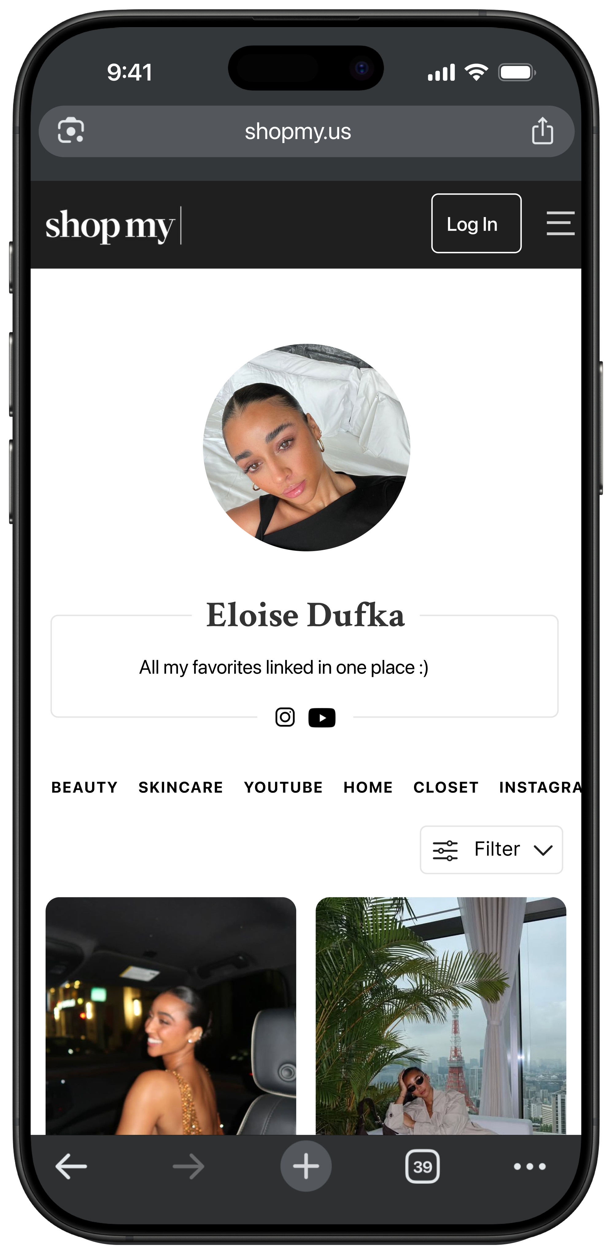
I designed a new feature for ShopMy, a social shopping platform where creators curate and share their favorite fashion and lifestyle products. The goal was to improve product discovery within creator storefronts by introducing a filtering system that helps users navigate large collections more efficiently.
This project was completed using the platform’s interface prior to ShopMy’s major 2025 product redesign, which significantly updated the visual layout and browsing experience. My work focuses on improving product discovery within the earlier version of the platform while respecting its creator-led commerce model.
Role
UX Designer
User interviews · Problem framing · Wireframing · Interaction design · Prototyping · Iteration
Timeline: 6 weeks
Platform Selection & Constraint Analysis
I selected ShopMy, an influencer storefront platform, as the subject for a new feature design project. I conducted platform analysis and competitive research to understand ShopMy's unique role as a connector (not retailer) between creators, consumers, and brands, identifying technical constraints that would shape all design decisions.
Chose ShopMy based on personal experience and strategic alignment: As someone who follows lifestyle creators and shops through their links, I identified an opportunity to improve product discovery while respecting the creator-brand relationship that differentiates ShopMy from traditional e-commerce platforms. This alignment with my long-term UX goals in fashion, beauty, and lifestyle made it an ideal learning opportunity.
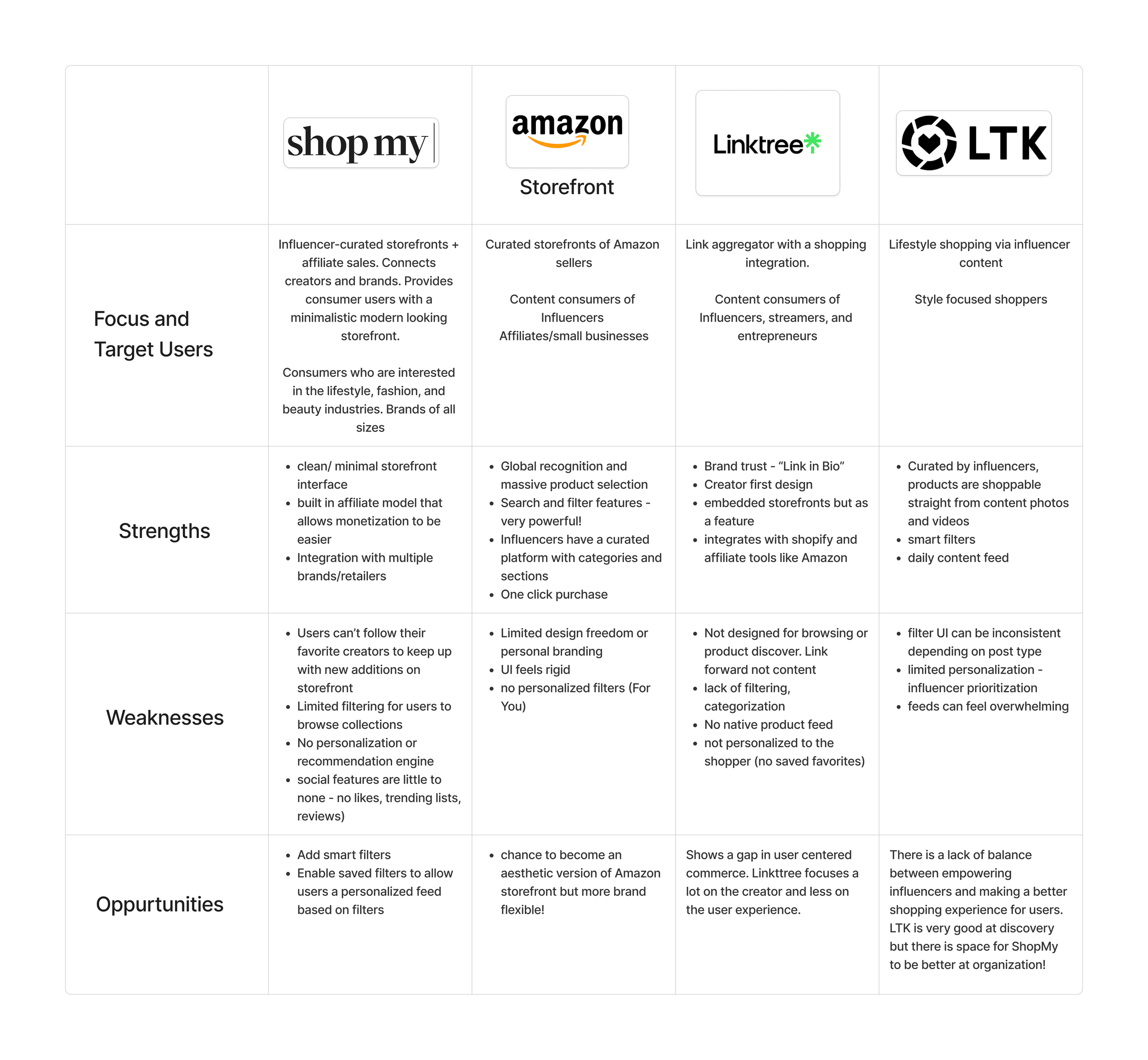
Conducted competitive analysis to identify standard e-commerce features that ShopMy was missing, including filtering tools, saved searches, and personalized product recommendations. This research revealed that competing platforms like LTK and Amazon Storefront offered robust filtering by category, price, and brand.
Identified critical technical constraints through platform research: ShopMy links to external retailers rather than warehousing products, meaning it doesn't control backend product data like inventory, size availability, or dynamic pricing. This realization reframed my entire approach. Features relying on rich, structured product data (like price alerts or size-based filtering) weren't feasible within the existing ecosystem, requiring me to focus on solutions that worked within ShopMy's connector model.
Problem Identification & Hypothesis Formation
I observed that while creators excel at curating collections, users face a fragmented shopping experience when navigating product-heavy storefront pages. Hypothesized that implementing filtering tools would improve engagement metrics while supporting ShopMy's affiliate revenue model.
Identified the core problem through user observation: Users visiting influencer storefronts with dozens or hundreds of items had no way to quickly narrow down options based on their needs (e.g., "skincare under $50" or "vacation outfits"). This forced endless manual scrolling, creating friction that likely reduced engagement and click-through rates to external retailers.
Formed initial hypothesis: Implementing a filter tool would improve user satisfaction, time on page, and click-through rates by giving users control over how they navigate curated content. Early assumptions suggested users would want deep filtering functionality by size, brand, price, and occasion.
Aligned user frustrations with business opportunity: More engaged users spending meaningful time on creator storefronts translates directly to higher click-through rates to products, which drives ShopMy's affiliate revenue. A feature that reduces friction and improves product discovery serves both user needs and business goals, validating the problem's strategic importance.
Initial Concept & A Reality Check
I designed an ambitious onboarding-based personalization system that would auto-filter storefronts based on user preferences. Quickly discovered this approach was technically infeasible due to platform constraints, forcing a pivot to a simpler, more viable solution.
Created initial concept: auto-filtering via onboarding preferences: Designed an onboarding flow asking users to set preferences like price range, clothing size, and category interests, which would dynamically shape how storefronts appeared. While this felt like strong personalization strategy, it didn't account for ShopMy's technical realities.
Hit a critical roadblock during feasibility assessment: ShopMy doesn't store product metadata like sizing or live pricing because each product is essentially a visual link to third-party sites where that data lives. Features like auto-filtering by size availability or dynamic price ranges would require major backend changes and access to data ShopMy doesn't own.
Pivoted from complexity to clarity: Rather than over-engineering a solution or attempting to reinvent the system, I reframed the question from "How can we personalize everything?" to "How can we give users simple control?" This led to a lightweight, context-aware filtering tool that worked within ShopMy's existing infrastructure, with an added feature allowing users to save frequently-used filter combinations for quick access in hope to creating a semi-personalized layer without requiring backend restructuring.

User Research & Validation
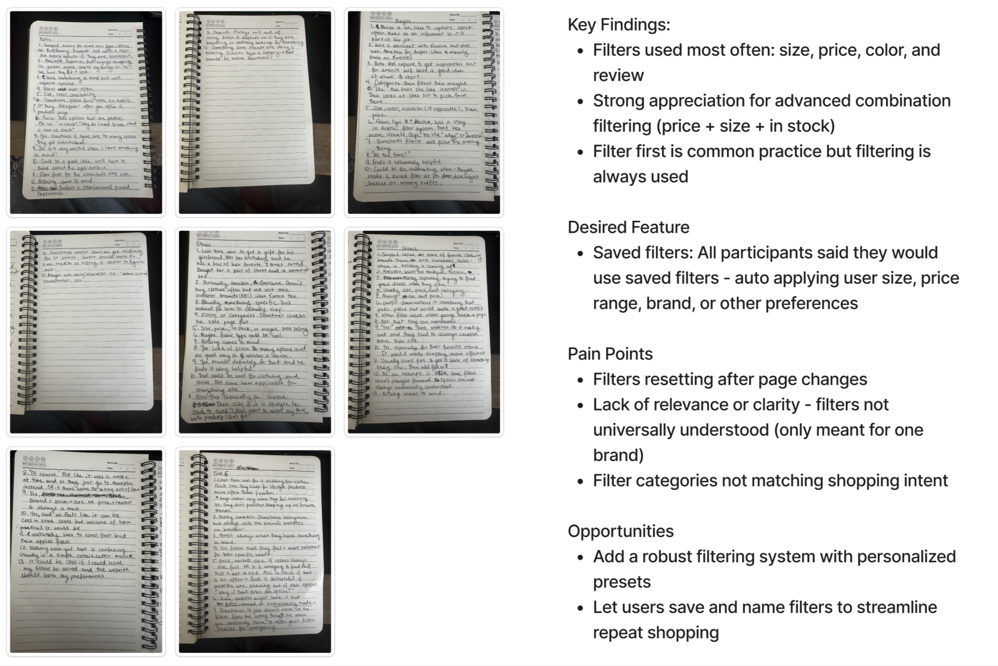
I conducted 5 user interviews with regular online shoppers to understand how people interact with e-commerce platforms and what role filtering plays in their shopping behavior. Research validated that filtering tools are expected baseline functionality, helping deprioritize complex features in favor of intuitive basics.
Interviewed 5 participants who regularly buy products online, conducting 15 minute sessions focused on how users discover new products, navigate large product catalogs, and what their expectations are for shopping experiences rooted in curation. Used open-ended questions to let themes emerge naturally rather than confirming existing assumptions.
Identified key insight: filters as default expectation, not premium feature: Users consistently reported looking for filtering tools immediately when faced with large volumes of options. It's not a "nice to have" but an expected standard, especially when shopping. The absence of filters created immediate friction and reduced trust in the platform's sophistication.
Reprioritized user needs over product assumptions: Interview insights helped me decenter my initial assumptions about advanced personalization and refocus on what users actually wanted: basic, intuitive filters providing better control over product discovery. No AI recommendations, no auto-sorting, just the ability to quickly narrow down options by category, brand, and price range.
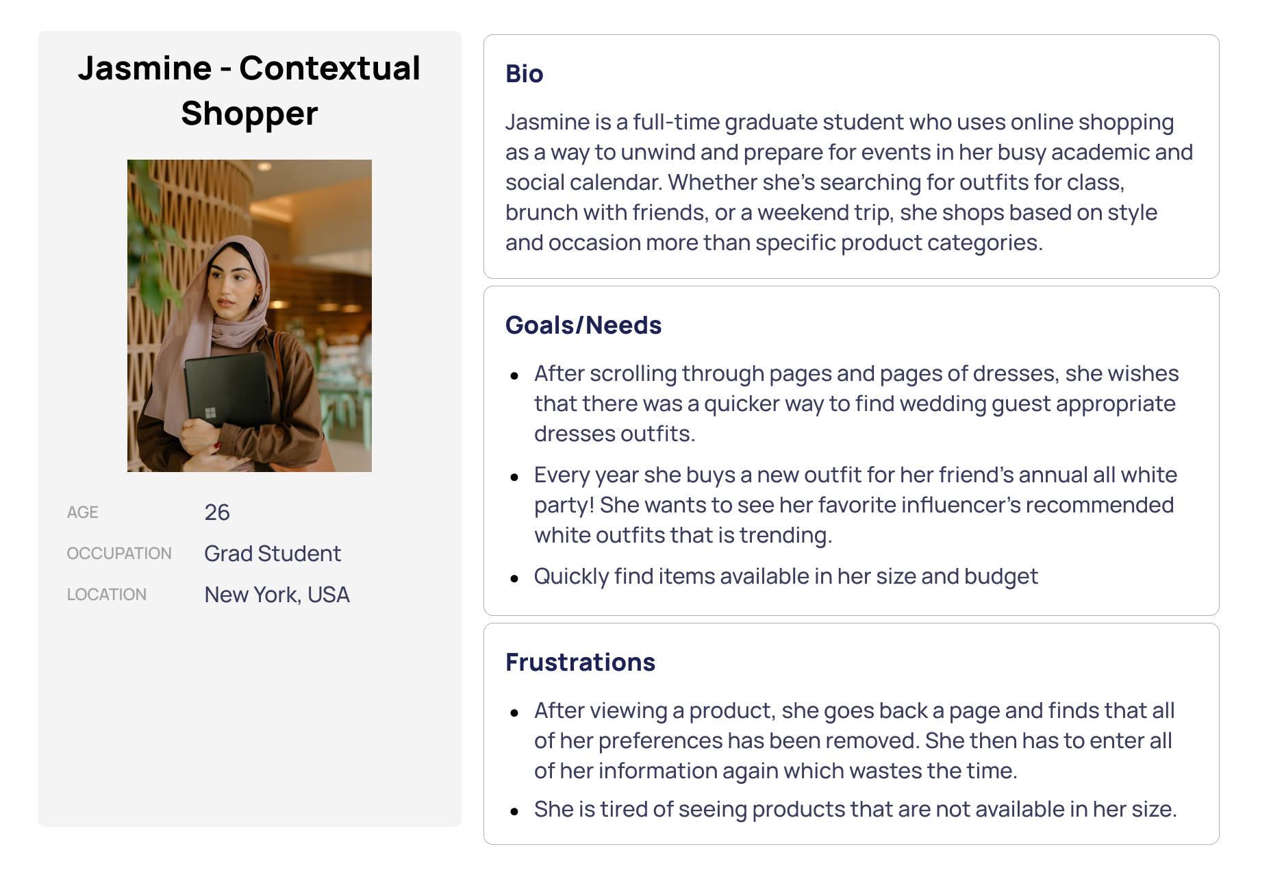
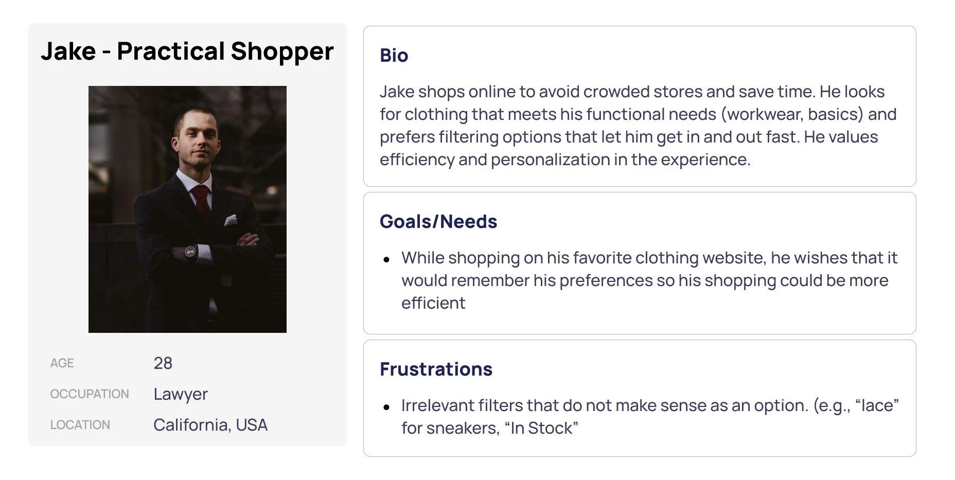
User Personas
Low-Fidelity Design & Iteration
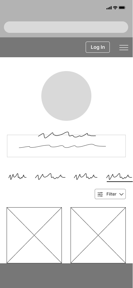
I created low-fidelity wireframes exploring different ways filters could be displayed and accessed, then tested the intuitiveness of the user flow to identify friction points.
Tested wireframes to validate interaction patterns: While ShopMy already offers a clean, intuitive UI, research revealed that introducing overly complex interactions led to user hesitation. Participants consistently preferred clear labels, fast responsiveness, and layouts that didn't require second-guessing the more minimal and focused the design, the more confident and in control users felt.
Prioritized simplicity and visual consistency: Made a deliberate effort to maintain visual clarity and reduce friction by aligning closely with ShopMy's existing design language. The result was a seamless extension that tested successfully with users because it felt native to the platform rather than bolted on.
High-Fidelity Prototyping
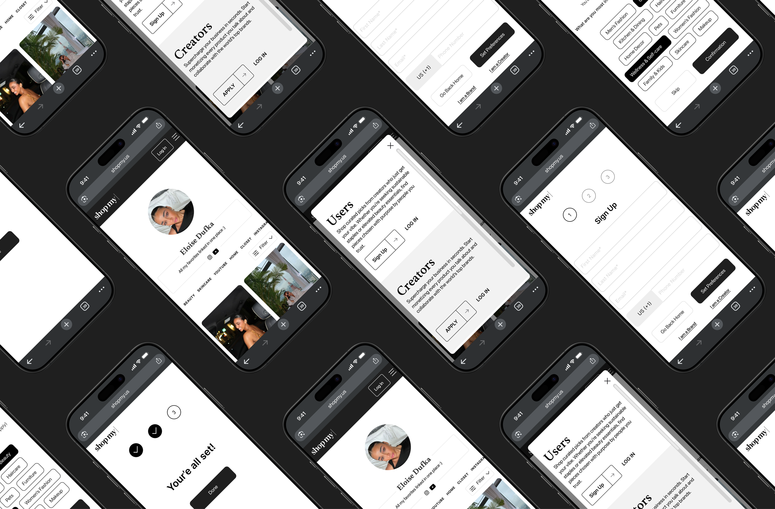
I built a high-fidelity prototype simulating the complete experience from landing on a storefront to creating saved filter sets, with special attention to mobile ergonomics and visual hierarchy.
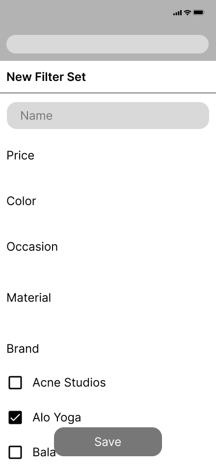
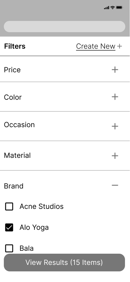
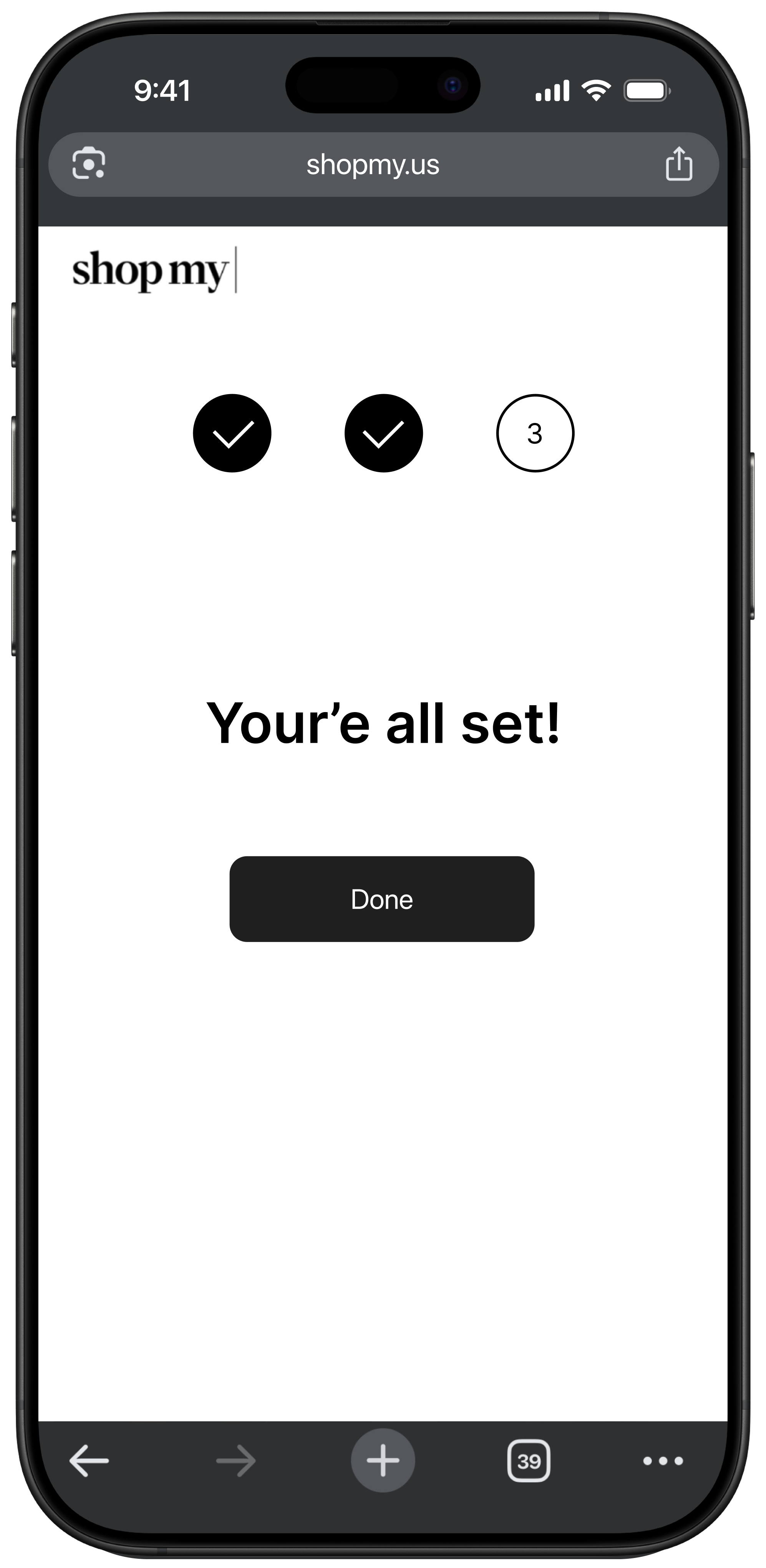
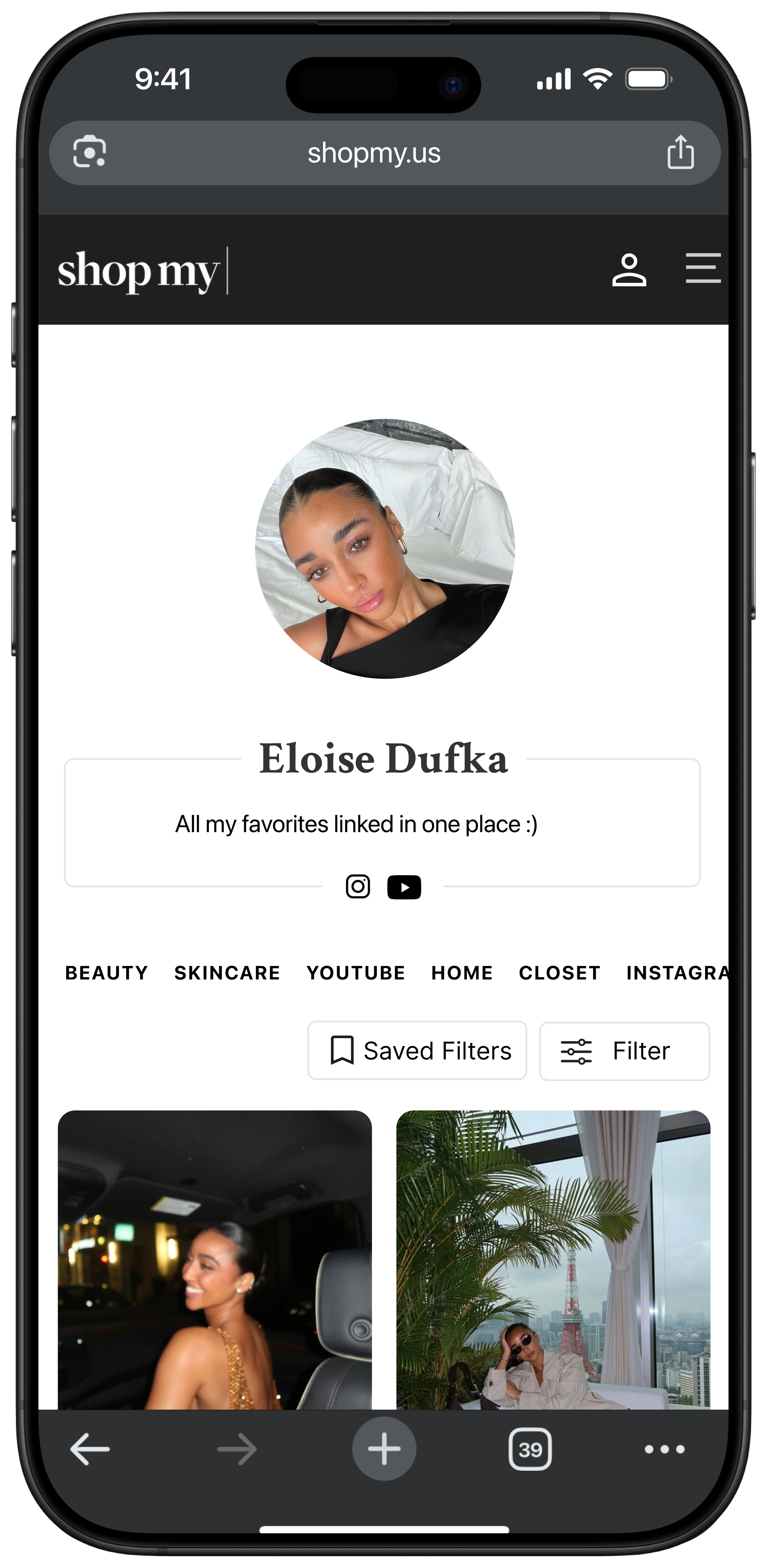
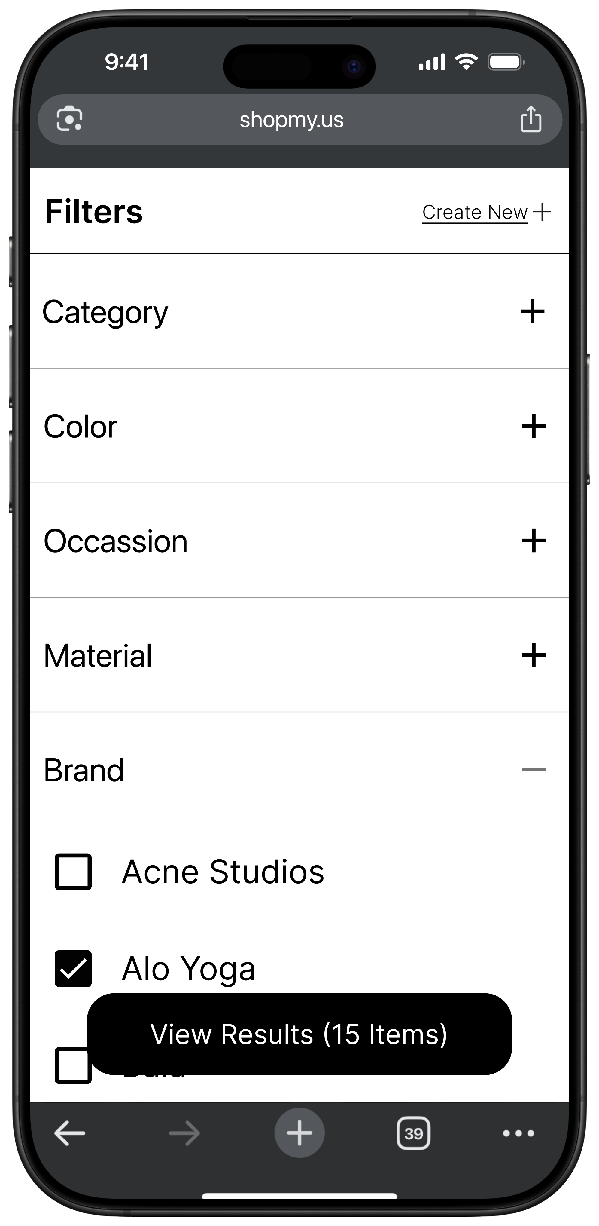
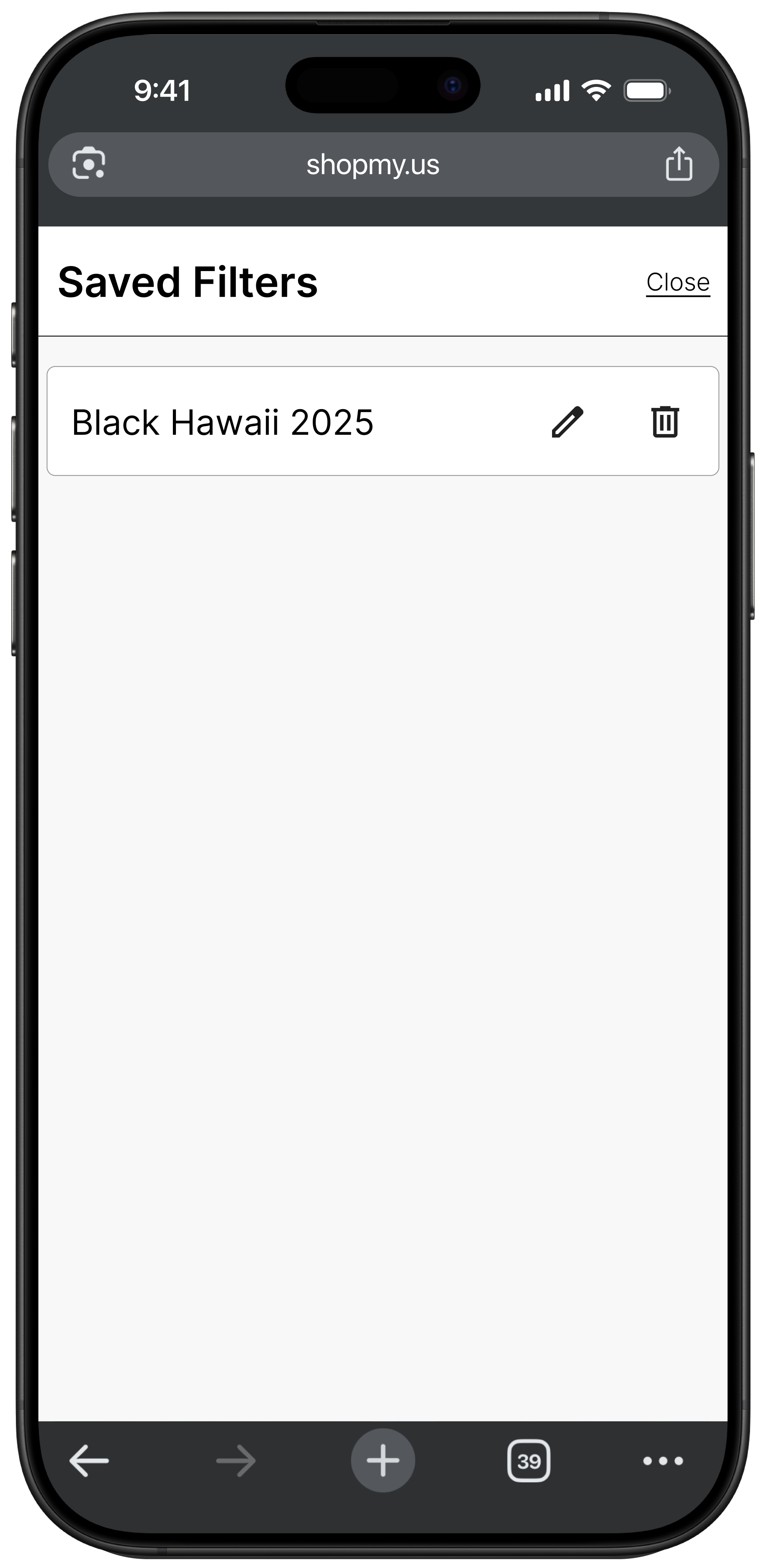
Designed key screens optimizing for mobile interactions: Prototype includes updated storefront with filter button fixed to top of content (always accessible), modal with collapsible filter categories (brand, product type, price range), option to create and name saved filter sets for logged-in users, and instant updates to product feed based on selections. All added features were designed with mobile tap targets and thumb-friendly zones in mind.
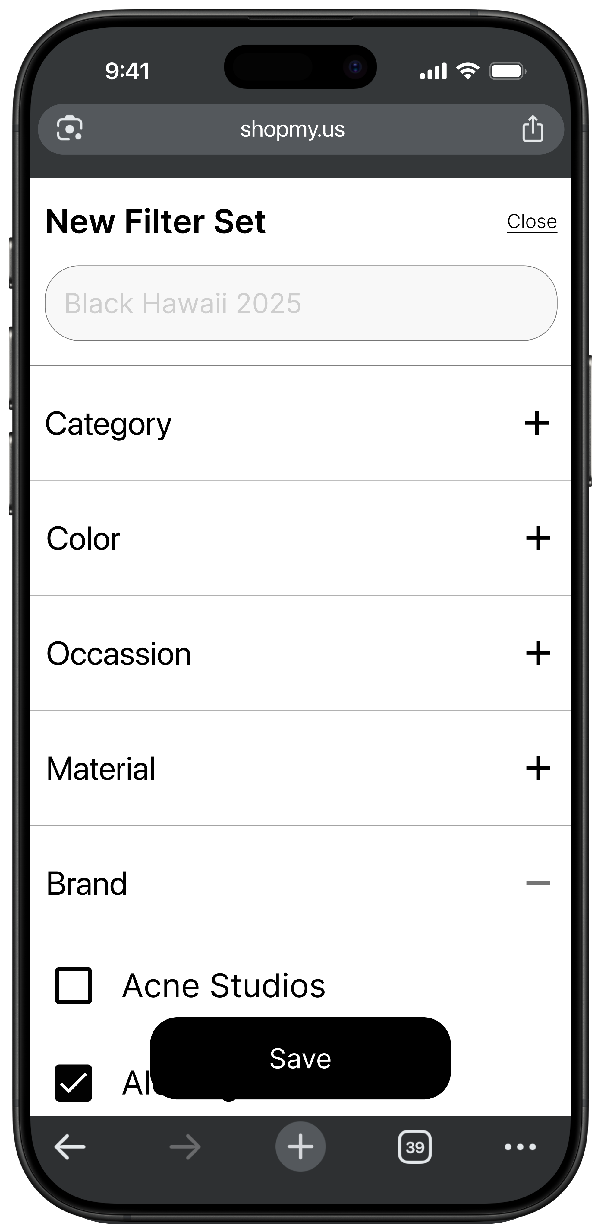
Implemented saved filter functionality for returning users: Logged-in users can create saved filter sets (e.g., "Clean Beauty Under $50" or "Vacation Essentials") for instant access across different creator storefronts, creating a personalized experience without requiring backend product data changes. This feature emerged from user feedback about returning to similar searches across multiple creators.
Demonstrated complete user flow from discovery to filtered results: Users land on creator page, tap filter button, select interests using intuitive controls, see immediate visual feedback as products update, and can save their configuration for future use. Each interaction was refined based on mobile ergonomics, visual hierarchy, and alignment with ShopMy's premium aesthetic.
Reflection
What I learned: This project taught me that meaningful UX doesn't always require reinvention. Sdometimes it means removing friction in the right places while respecting the integrity of an existing business model.
Constraints as creative fuel: ShopMy's limitations (no backend product data, third-party retail links) initially felt restrictive but ultimately forced me to think critically about what was essential versus what was ambitious. The constraint of working within their connector model led to a cleaner, more implementable solution than my original over-engineered concept.
The pivot from complex to simple: My first design direction, personalized auto-filtering via onboarding, was too ambitious for the platform's technical reality. When I focused on users' core needs (basic control over product discovery), the solution became obvious: let people filter by what they care about, quickly and clearly, without requiring impossible backend changes.
Designing features that respect business structure: A critical takeaway was understanding how UX decisions must align with business models. ShopMy isn't traditional e-commerce, it's a connector platform. My final design respects that role while enhancing the user journey in a tangible way, proving that understanding constraints early leads to better, more realistic solutions.
If I had more time: I would conduct testing with the live feature to measure impact on click-through rates and time on page, and explore how saved filter sets could inform creator insights (e.g., "Your audience frequently filters for sustainable brands under $100"). I'd also investigate whether filter usage patterns could help creators better curate their storefronts without compromising ShopMy's hands-off connector model.