
Two Vera
(formerly Unlatched)
Designing Intentional Connection in Modern Dating
Two Vera is a therapist-founded dating app focused on fostering more intentional, emotionally intelligent connections. Working from an inherited brand and early onboarding flow, my team and I designed the core product experience, including browsing, matching, and messaging systems.
Through user research, competitive analysis, and iterative testing, we identified key gaps in modern dating platforms, including shallow discovery, low emotional impact in matches, and rapid drop-off after connection. In response, I designed features such as dual-profile exploration, engagement-based interaction gates, and a reimagined match moment to create a more thoughtful and differentiated experience.
The final solution balances emotional depth with usability, aligning closely with the app’s core mission while providing a scalable foundation for future development.
Overview
Role
Product Designer (UX/UI)
Interaction design · Behavioral UX · Feature innovation · Collaborative product design
Timeline: 10 weeks
Inheriting a Foundation & Establishing Team Structure
I joined a two-person design team tasked with creating the core user experience for Unlatched, a therapist-founded dating app. Audited existing brand identity and sign-up flow from a previous team, then strategically divided feature ownership to maximize depth while maintaining cohesion across an internationally distributed collaboration.
Conducted brand and UX audit of inherited work: Analyzed the existing sign-up flow, brand positioning, and emotional tone established by the previous team to understand the product's foundation. This audit identified gaps in continuity between onboarding and core product experience, revealing opportunities to extend the brand vision into feed, matching, and messaging systems.
Established clear feature ownership across a distributed team: As a two-person team based in California, USA and Armenia, we intentionally divided responsibilities. I led the User Feed and Match experience focusing on discovery and emotional connection processing, while my teammate focused on the Post Match experience and messaging systems. We maintained cohesion through structured documentation, shared interaction principles, and weekly design critiques.
Grounded design decisions in the app's therapist-founded mission: Evaluated every interaction pattern against the core principle of encouraging emotional intelligence, curiosity, and thoughtful engagement over volume-based matching. This meant designing browsing and match architecture that supported intentional decision-making rather than habitual swiping behaviors common in mainstream dating apps.
Research Driven Problem Framing
We conducted qualitative user interviews and competitive analysis to ground design decisions in real user behavior and market positioning. Research revealed four primary opportunity areas where existing dating apps create shallow, disengaging experiences.
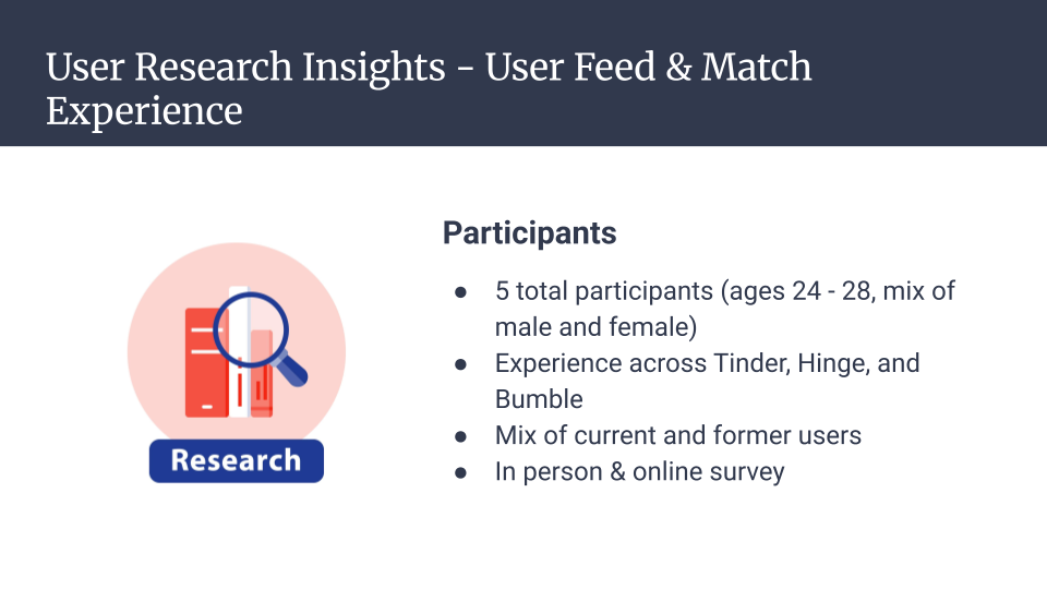
Interviewed 5 active dating app users to explore their emotional experience while browsing, matching, and messaging. Conducted in-depth qualitative sessions uncovering patterns across all participants: feeds felt repetitive and surface-level, swiping became automatic rather than intentional, matches created momentary excitement that quickly lost meaning when conversations stalled.
Conducted competitive analysis of Hinge, OkCupid, and Tinder to understand market differentiation strategies and interaction patterns. While each platform attempted differentiation through prompts or algorithms, most still relied on rapid swipe mechanics and front-loaded profile information—reinforcing behavioral loops of snap judgment rather than layered discovery.
Synthesized research into four primary opportunity areas: Dating feeds feel shallow and promote surface-level judgments; match moments lack emotional impact and fail to feel meaningful; engagement drops significantly after matching due to lack of conversational support; messaging tools fail to sustain meaningful conversation beyond initial exchanges. These insights directly informed feature ideation and interaction strategy.
Concept Innovation & Differentiated Interaction Design
We developed interaction models that interrupt passive swiping and encourage deeper evaluation through dual-profile browsing, engagement gates, progressive reveal systems, and elevated match moments. Each feature was designed to address specific drop-off points identified in research.
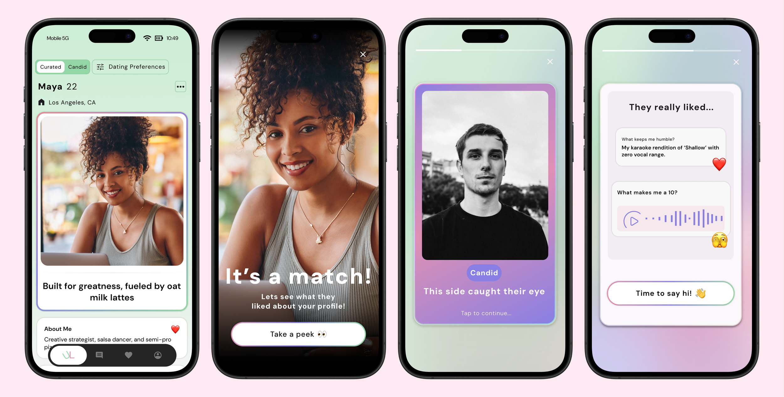
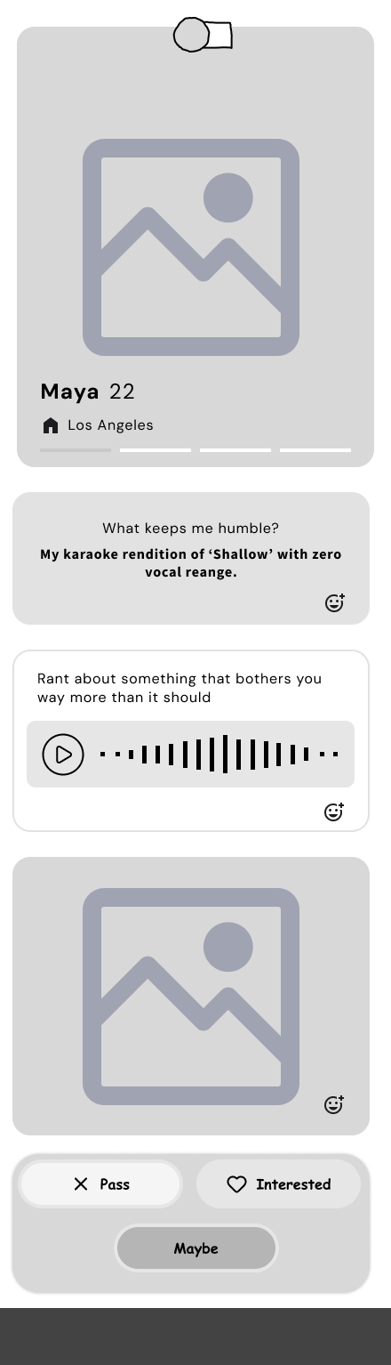
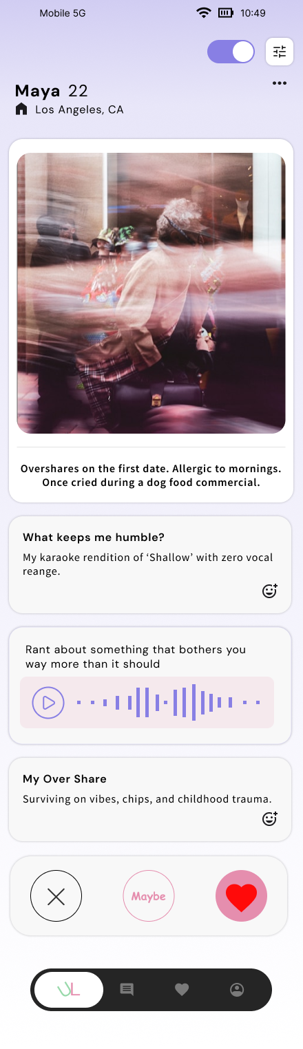
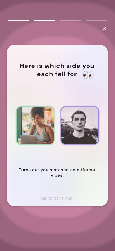
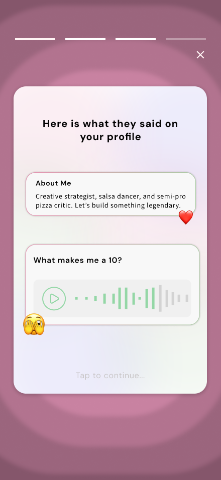
Designed with a dual-profile browsing concept (initially "Hype and Unhinged"). Worked closely with stakeholder to develop a two-dimensional identity presentation showing both a polished, curated side and a more candid, expressive side. This structure was designed to reduce performative self-presentation common on dating apps and encourage layered discovery that reveals authentic personality over time.
Introduced "Engagement Gates" to discourage impulsive swiping: Before making a swipe decision, users must interact with 2-3 profile elements such as tapping shared interests, expanding a short story, or listening to a brief voice note. This intentional friction was designed to slow cognitive processing and promote more thoughtful matching behavior rather than split-second judgments based on photos alone.
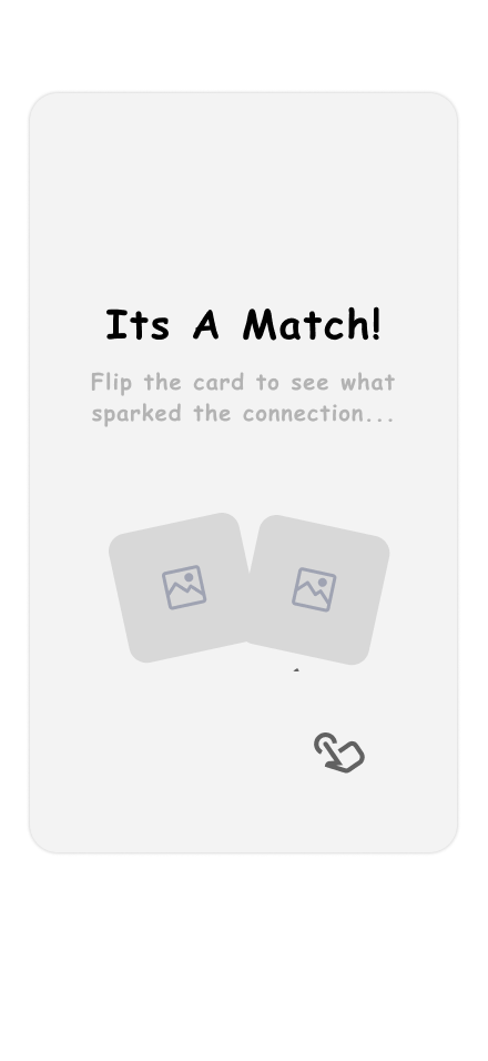
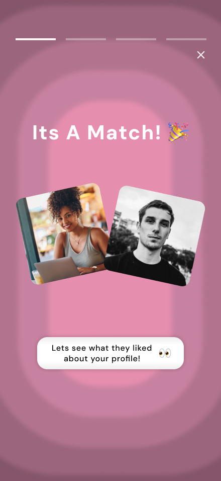
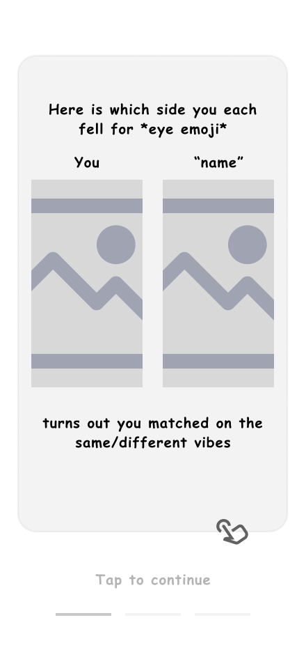
Redesigned the match moment by creating a progressive reveal system and reframing profile exploration as something earned through engagement rather than passively consumed. This mechanic reinforces intentionality and creates anticipation throughout the browsing experience.
Collaborated on AI-enhanced messaging interface: Worked with teammate to incorporate contextual prompts and tone-aware suggestions designed to maintain conversational momentum and encourage emotionally intelligent exchanges without removing authenticity or making conversations feel scripted.
Stakeholder Collaboration & Alignment
We maintained close collaboration with founder through weekly working sessions and structured presentations to ensure alignment between brand vision, user research, and design execution.
Conducted weekly working sessions with founder using structured presentation decks that clearly articulated research findings, feature rationale, tradeoffs, and proposed next steps. This structured approach ensured shared understanding and created space for collaborative decision-making rather than one-way design delivery.
Facilitated collaborative discussions when user feedback challenged assumptions: Because this was an early-stage product, strategic alignment was as critical as interface execution. When testing revealed issues with initial concepts, led discussions that balanced brand intent with behavioral evidence to arrive at solutions that honored both.
Delivered comprehensive final package including refined high-fidelity prototype, documented design rationale explaining the "why" behind each decision, and forward-looking recommendations for future testing and iteration. This ensured the founder had both a tangible product experience for development and a strategic roadmap for continued evolution.
Iterative Prototyping & Usability Testing
We translated concepts into low-, mid-, and high-fidelity wireframes to test structure, flow clarity, and tone before visual refinement. Usability testing revealed critical terminology issues that led to a product rebrand, demonstrating responsiveness to user feedback over attachment to original concepts.
Progressed through multiple fidelity levels strategically: Created low-fidelity wireframes to test core structure and interaction concepts, mid-fidelity to validate flow clarity and information architecture, and high-fidelity to refine visual tone and micro-interactions. This approach allowed us to test and iterate on fundamental concepts before investing in polished visual design.
Focused early usability testing on comprehension and interaction clarity: Tested whether users understood the dual-profile concept's purpose, could successfully navigate engagement gate requirements, and perceived the progressive reveal system as rewarding rather than restrictive. This foundational testing ensured core mechanics worked before layering visual polish.
Discovered critical terminology issue through user feedback: Several participants interpreted the term "Unhinged" negatively, conflicting with the app's emotionally grounded, therapist-founded positioning. Rather than defending our original concept or dismissing feedback, we treated this as an opportunity to refine framing while maintaining the core dual-identity concept.
Led collaborative rebrand based on testing insights: Worked with founder to evolve the product name from Unlatched to TwoVera and reframe the dual-profile language from Hype/Unhinged to Curated/Candid. This shift maintained the layered identity concept while aligning with user perception and emotional tone, demonstrating flexibility and user-centered thinking over ego attachment. Incorporated all testing feedback into refined second-iteration prototype with documented rationale for each change.
Reflection & Key Learnings
What I learned: This project reinforced that successful product design requires balancing stakeholder vision with user evidence, especially in early-stage products where brand positioning is still crystallizing. Being responsive to user feedback—even when it challenges foundational concepts—leads to stronger outcomes than defending original ideas.
The power of intentional friction: Conventional dating app wisdom suggests removing all friction to maximize engagement. Our research revealed the opposite: thoughtful friction (engagement gates, progressive reveals) can actually increase meaningful engagement by interrupting automatic behaviors and encouraging curiosity. This challenged my assumptions about when to add versus remove steps in a user flow.
Terminology matters deeply in emotionally charged contexts: The "Unhinged" terminology issue taught me that word choice in sensitive product categories like dating carries weight beyond literal definitions. Users bring emotional associations that must be validated through testing, not assumed during internal brainstorming. What felt playful internally read as off-putting to actual users.
Distributed collaboration requires intentional structure: Working across time zones and feature areas could have created fragmented experiences, but establishing shared principles, documentation standards, and regular sync points ensured cohesion. This structure became even more critical when iterating quickly based on testing feedback.
Key trade-offs made: To keep scope manageable for an MVP, we prioritized the dual-profile browsing experience and engagement gates over more complex features like in-app events or video profiles. While these could enhance the experience, our research indicated the core matching mechanics needed to be fundamentally different from competitors before adding additional features.
If I had more time: I would conduct longitudinal studies to understand how engagement gate interactions affect match quality and conversation depth over time. I would explore if required interaction actually lead to better conversations, or if it just slow the process? I'd also explore how to make the progressive reveal system feel rewarding rather than withholding, potentially through gamification or social proof mechanics.